Oral-Pro Sàrl.
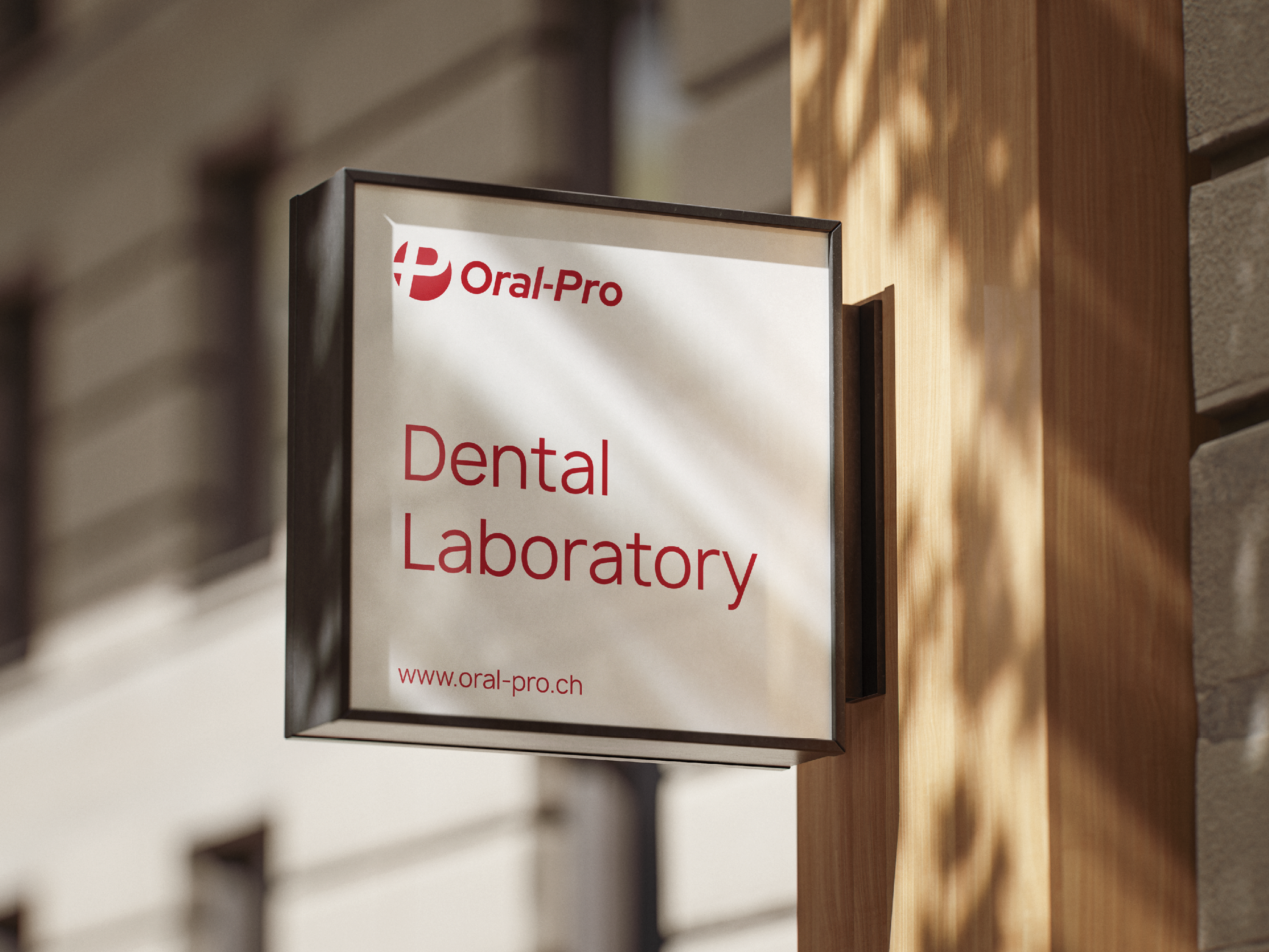
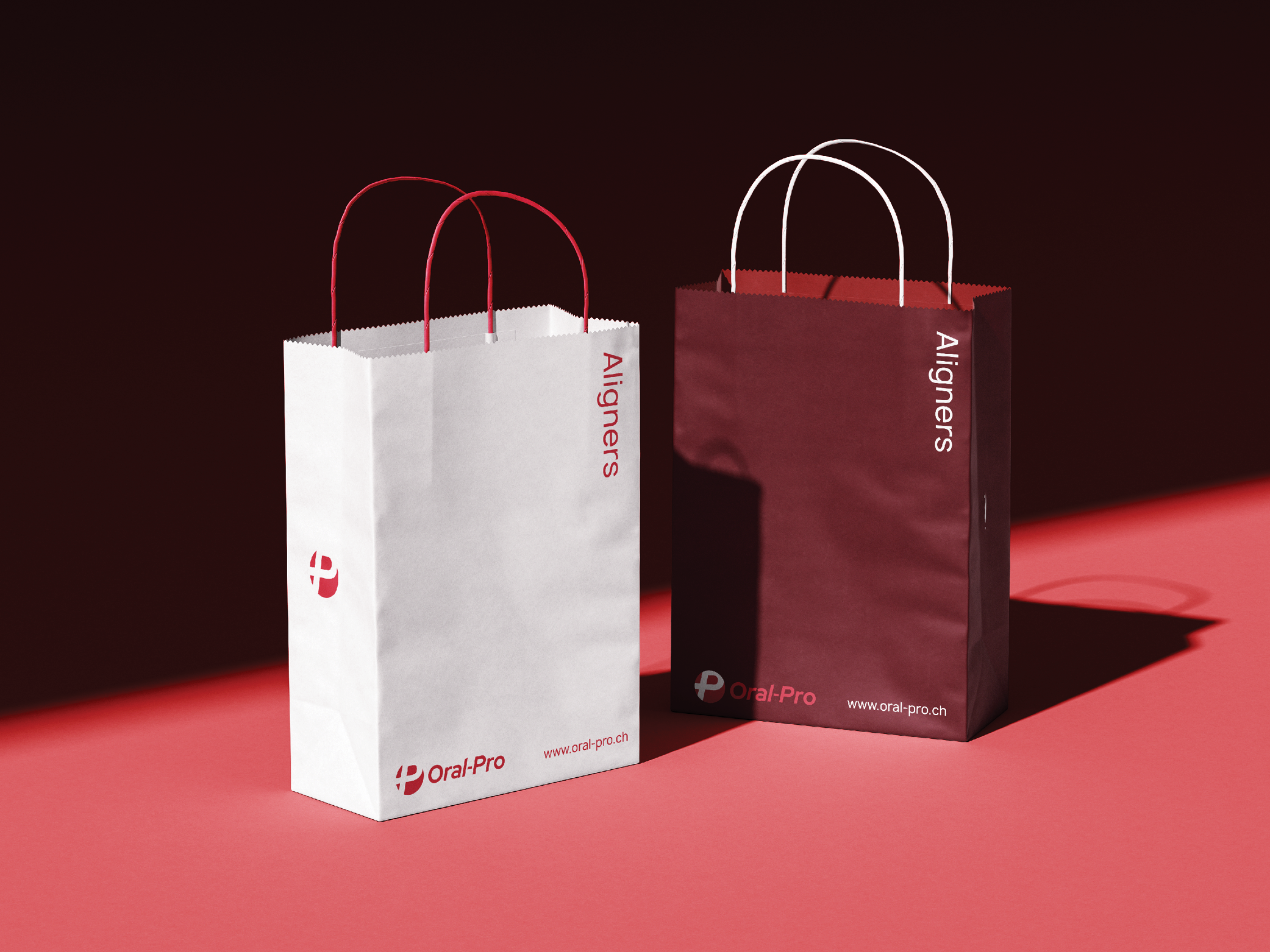
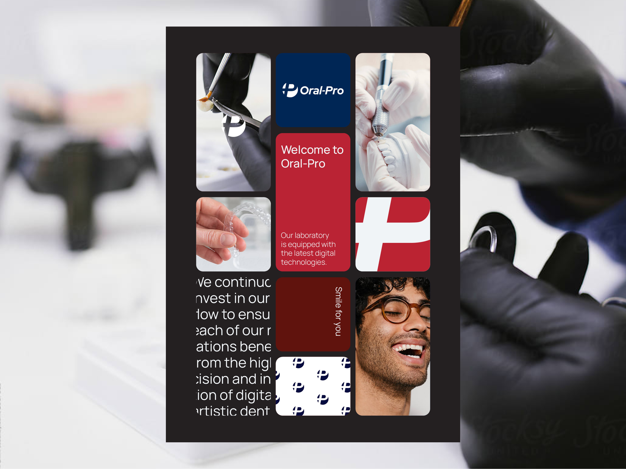
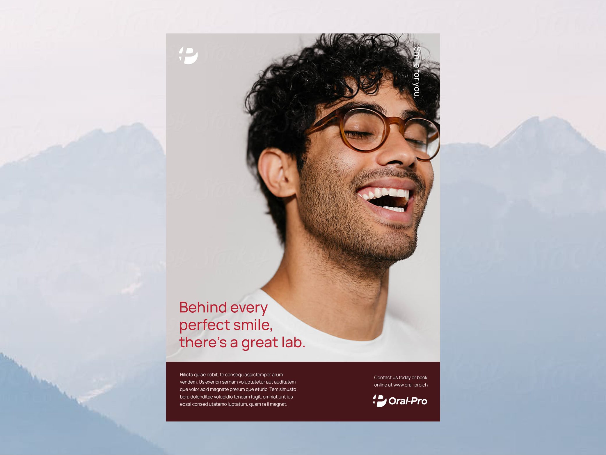
Brand Identity. Marketing & Collateral. Packaging.
Oral Pro is a leading dental technology practice built on clinical excellence and advanced technique. The existing identity had merit but had not kept pace with the organisation it represented.
The redesign centred on a single, precise idea - transformation. A custom italic 'P', extended to form a continuous loop and carry a subtle Swiss Cross reference, gave the mark both movement and meaning. A deep navy palette and gradient treatment completed an identity that is sophisticated, credible, and unmistakably forward-facing.
The result is a brand that finally reflects the quality of the work behind it.